
UX Research & Design
Beyond the Bounce Rate
How research-driven design helped reduce mobile bounce rates by 45.6% and improve visitor engagement.
Overview
PMP Marketing Group helps law firms grow through digital marketing and website development. Its Website Services page was designed to turn prospective clients into qualified leads, but the experience wasn't delivering.
With a 72% mobile bounce rate and visitors spending an average of just seven seconds engaging with the page, something wasn't connecting.
I led a UX research initiative to understand why visitors were leaving and translate those findings into a more effective, mobile-friendly experience.
The resulting redesign was followed by a 45.6% reduction in mobile bounce rate and a 186% increase in average mobile engagement time.
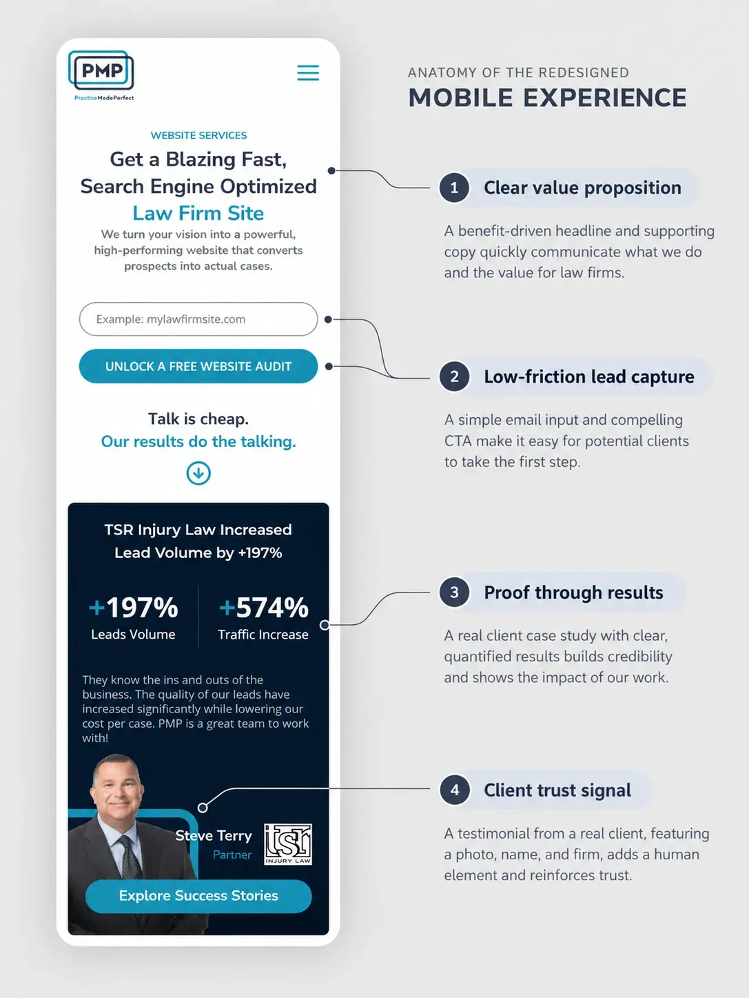
The redesigned Website Services page, built to communicate value more clearly, establish credibility, and help visitors move confidently toward an inquiry.
The Challenge
Visitors Were Arriving, but Not Staying
Google Analytics revealed a striking difference between devices.
Mobile visitors accounted for the majority of page views, yet 72.04% of mobile sessions bounced, compared to 29.27% on desktop.
And while desktop visitors engaged with the page for an average of 29 seconds, mobile visitors spent just seven.
The obvious assumption was that the mobile experience needed improvement.
But analytics could only tell us what was happening, not why.
Was the content difficult to navigate? Were the services confusing? Or were visitors simply unconvinced that PMP was the right agency for their needs?
Redesigning without answering those questions risked solving the wrong problem.
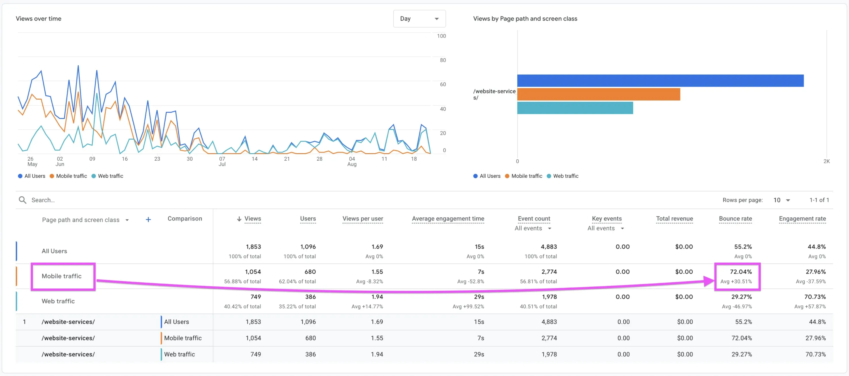
Initial analytics revealed a significant mobile engagement gap, prompting further investigation into the experience behind the numbers.
The Approach
Looking Beyond the Bounce Rate
I designed and led an unmoderated usability study through PlaybookUX, recruiting five legal professionals to evaluate the Website Services page across mobile and desktop experiences.
Participants were asked to approach the website as prospective clients looking for a law firm marketing partner.
I wanted to understand three things: what they understood, what made them hesitate, and what would give them enough confidence to inquire.
I also evaluated competing agencies, including Scorpion, to identify how they communicated their services and established credibility.
The Turning Point
The research revealed something more interesting than a simple mobile usability problem.
Visitors didn't necessarily struggle to navigate the experience. They struggled to find enough reasons to trust it.
Participants generally appreciated PMP's clean design and straightforward navigation. But the messaging didn't consistently answer the questions that mattered most.
Some service terminology was unclear.
"HIVE is confusing... just build me a website."
Others wanted tangible evidence of the agency's capabilities.
"I want to see what websites you've done."
And some questioned PMP's credibility altogether.
"Why would I trust you?"
The competitor analysis reinforced these findings. Agencies that showcased client testimonials, previous work, measurable results, and clear service offerings gave visitors more information to support their decisions.
The problem wasn't necessarily a lack of content. It was a lack of clarity, evidence, and confidence at critical moments in the experience.
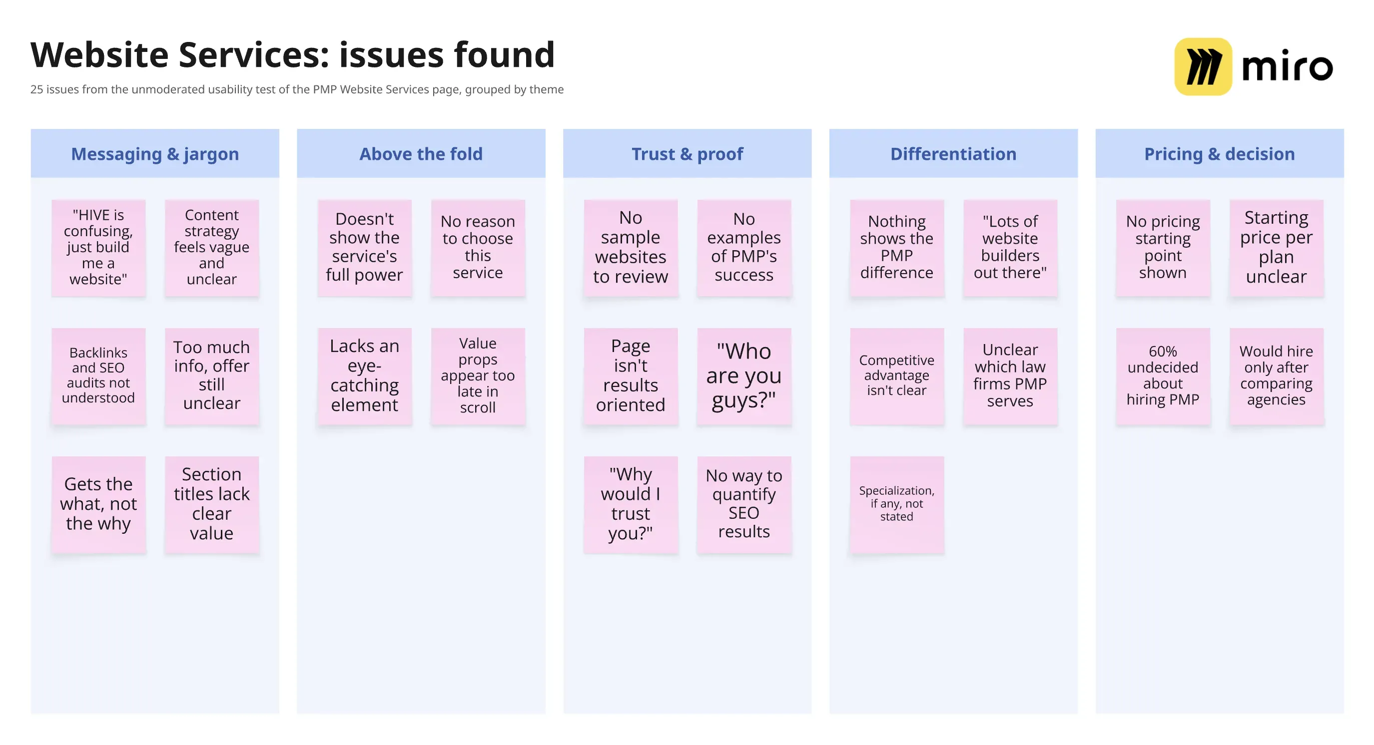
Usability testing and competitive analysis revealed recurring gaps in service clarity, credibility, and the information prospective clients needed to make decisions.
Turning Insights Into Design Decisions
I translated those findings into a redesigned experience centered on three priorities:
Clarity. Simplify service messaging, explain capabilities through customer benefits, and introduce the value proposition earlier.
Credibility. Make project examples, testimonials, and measurable results more prominent so visitors could evaluate PMP's expertise.
Conversion readiness. Reorganize the page into digestible sections with strategically placed calls to action, supporting visitors who needed more information before making contact.
The mobile layout received particular attention. Content was organized into clear, vertically stacked sections, making the experience easier to scan and understand on smaller screens.
Instead of asking visitors to inquire before they understood the offering, the redesigned page aimed to give them reasons to feel confident taking the next step.
[VISUAL 04 — From Insights to Interface]
Caption: The redesigned mobile experience introduced clearer messaging, tangible examples of work, credibility signals, and more intentional conversion opportunities.
The Outcome
From Seven Seconds to Twenty
Following implementation, Google Analytics reported substantial improvements in engagement, particularly on mobile devices.
Mobile bounce rate decreased from 72.04% to 39.20%, a 45.6% relative reduction.
Average mobile engagement time increased from 7 to 20 seconds, an improvement of approximately 186%.
Desktop bounce rate also improved, declining from 29.27% to 20.95%.
Metric | Before | After |
|---|---|---|
Mobile bounce rate | 72.04% | 39.20% |
Mobile engagement time | 7 seconds | 20 seconds |
Desktop bounce rate | 29.27% | 20.95% |
Desktop engagement time | 29 seconds | 34 seconds |
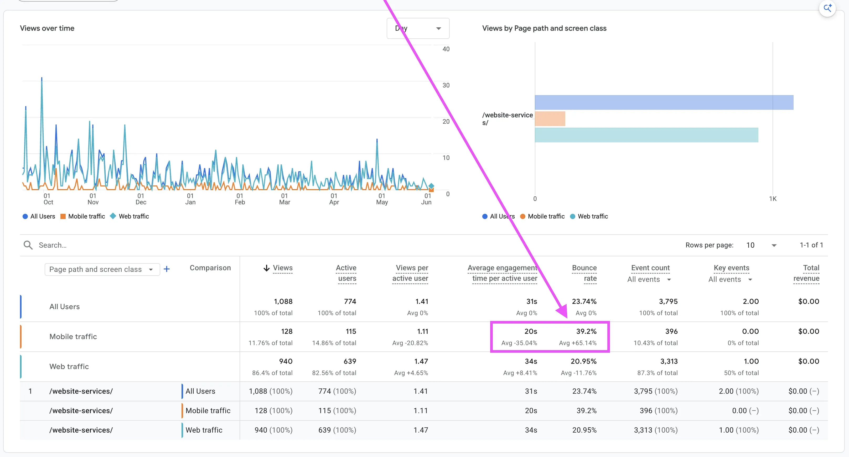
Post-redesign analytics showed a 45.6% relative reduction in mobile bounce rate and nearly three times the average mobile engagement time.
These improvements aligned with the project's engagement objectives and suggested that the redesigned experience was better supporting visitors.
While traffic volumes varied and formal conversion tracking wasn't set up, user engagement increased substantially—and direct inbox notifications confirmed a steady flow of qualified inquiries that hadn't existed before.
Final Thoughts
Good Design Doesn't Just Attract Attention. It Builds Confidence.
This project challenged an assumption I could easily have made: that a high mobile bounce rate meant the interface simply needed better responsive design.
The research revealed a deeper problem.
Visitors could navigate the page, but they didn't always have the information they needed to make a decision.
By combining behavioral analytics with qualitative research, I was able to move beyond assumptions and design around the questions prospective customers were actually asking.
The experience reinforced an important principle I carry into my work:
Effective UX isn't just about making something easier to use. It's about helping people understand its value and feel confident about what to do next.